Chapter 3 Clustering big data
Clustering is a popular unsupervised method and an essential tool for Big Data Analysis. Clustering can be used either as a pre-processing step to reduce data dimensionality before running the learning algorithm, or as a statistical tool to discover useful patterns within a dataset
Clustered Computing
Because of the qualities of big data, individual computers are often inadequate for handling the data at most stages. To better address the high storage and computational needs of big data, computer clusters are a better fit.
Big data clustering software combines the resources of many smaller machines, seeking to provide a number of benefits:
- Resource Pooling: Combining the available storage space to hold data is a clear benefit, but CPU and memory pooling is also extremely important. Processing large datasets requires large amounts of all three of these resources.
- High Availability: Clusters can provide varying levels of fault tolerance and availability guarantees to prevent hardware or software failures from affecting access to data and processing. This becomes increasingly important as we continue to emphasize the importance of real-time analytics.
- Easy Scalability: Clusters make it easy to scale horizontally by adding additional machines to the group. This means the system can react to changes in resource requirements without expanding the physical resources on a machine.
Using clusters requires a solution for managing cluster membership, coordinating resource sharing, and scheduling actual work on individual nodes. Cluster membership and resource allocation can be handled by software like Hadoop’s YARN (which stands for Yet Another Resource Negotiator) or Apache Mesos.
The assembled computing cluster often acts as a foundation which other software interfaces with to process the data. The machines involved in the computing cluster are also typically involved with the management of a distributed storage system, which we will talk about when we discuss data persistence.
Ingesting Data into the System
Data ingestion is the process of taking raw data and adding it to the system. The complexity of this operation depends heavily on the format and quality of the data sources and how far the data is from the desired state prior to processing.
One way that data can be added to a big data system are dedicated ingestion tools. Technologies like Apache Sqoop can take existing data from relational databases and add it to a big data system. Similarly, Apache Flume and Apache Chukwa are projects designed to aggregate and import application and server logs. Queuing systems like Apache Kafka can also be used as an interface between various data generators and a big data system. Ingestion frameworks like Gobblin can help to aggregate and normalize the output of these tools at the end of the ingestion pipeline.
During the ingestion process, some level of analysis, sorting, and labelling usually takes place. This process is sometimes called ETL, which stands for extract, transform, and load. While this term conventionally refers to legacy data warehousing processes, some of the same concepts apply to data entering the big data system. Typical operations might include modifying the incoming data to format it, categorizing and labelling data, filtering out unneeded or bad data, or potentially validating that it adheres to certain requirements.
With those capabilities in mind, ideally, the captured data should be kept as raw as possible for greater flexibility further on down the pipeline.
K-Means Clustering Algorithm
K-Means Clustering is an unsupervised learning algorithm that is used to solve the clustering problems in machine learning or data science. In this topic, we will learn what is K-means clustering algorithm, how the algorithm works, along with the Python implementation of k-means clustering.
What is K-Means Algorithm?
K-Means Clustering is an Unsupervised Learning algorithm
, which groups the unlabeled dataset into different clusters. Here K defines the number of pre-defined clusters that need to be created in the process, as if K=2, there will be two clusters, and for K=3, there will be three clusters, and so on.
It is an iterative algorithm that divides the unlabeled dataset into k different clusters in such a way that each dataset belongs only one group that has similar properties.
It allows us to cluster the data into different groups and a convenient way to discover the categories of groups in the unlabeled dataset on its own without the need for any training.
It is a centroid-based algorithm, where each cluster is associated with a centroid. The main aim of this algorithm is to minimize the sum of distances between the data point and their corresponding clusters.00:00/02:42
The algorithm takes the unlabeled dataset as input, divides the dataset into k-number of clusters, and repeats the process until it does not find the best clusters. The value of k should be predetermined in this algorithm.
The k-means clustering
algorithm mainly performs two tasks:
- Determines the best value for K center points or centroids by an iterative process.
- Assigns each data point to its closest k-center. Those data points which are near to the particular k-center, create a cluster.
Hence each cluster has datapoints with some commonalities, and it is away from other clusters.
The below diagram explains the working of the K-means Clustering Algorithm:

How does the K-Means Algorithm Work?
The working of the K-Means algorithm is explained in the below steps:
Step-1: Select the number K to decide the number of clusters.
Step-2: Select random K points or centroids. (It can be other from the input dataset).
Step-3: Assign each data point to their closest centroid, which will form the predefined K clusters.
Step-4: Calculate the variance and place a new centroid of each cluster.
Step-5: Repeat the third steps, which means reassign each datapoint to the new closest centroid of each cluster.
Step-6: If any reassignment occurs, then go to step-4 else go to FINISH.
Step-7: The model is ready.
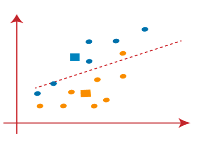
Let’s understand the above steps by considering the visual plots: Suppose we have two variables M1 and M2. The x-y axis scatter plot of these two variables is given below:

- Let’s take number k of clusters, i.e., K=2, to identify the dataset and to put them into different clusters. It means here we will try to group these datasets into two different clusters.
We need to choose some random k points or centroid to form the cluster. These points can be either the points from the dataset or any other point. So, here we are selecting the below two points as k points, which are not the part of our dataset. Consider the below image:

Now we will assign each data point of the scatter plot to its closest K-point or centroid. We will compute it by applying some mathematics that we have studied to calculate the distance between two points. So, we will draw a median between both the centroids. Consider the below image:

From the above image, it is clear that points left side of the line is near to the K1 or blue centroid, and points to the right of the line are close to the yellow centroid. Let’s color them as blue and yellow for clear visualization.

As we need to find the closest cluster, so we will repeat the process by choosing a new centroid. To choose the new centroids, we will compute the center of gravity of these centroids, and will find new centroids as below:

Next, we will reassign each datapoint to the new centroid. For this, we will repeat the same process of finding a median line. The median will be like below image:
From the above image, we can see, one yellow point is on the left side of the line, and two blue points are right to the line. So, these three points will be assigned to new centroids.

As reassignment has taken place, so we will again go to the step-4, which is finding new centroids or K-points.
- We will repeat the process by finding the center of gravity of centroids, so the new centroids will be as shown in the below image:

As we got the new centroids so again will draw the median line and reassign the data points. So, the image will be:

We can see in the above image; there are no dissimilar data points on either side of the line, which means our model is formed. Consider the below image:
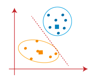
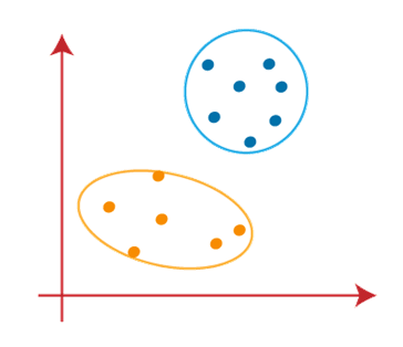
As our model is ready, so we can now remove the assumed centroids, and the two final clusters will be as shown in the below image:
How to choose the value of “K number of clusters” in K-means Clustering?
The performance of the K-means clustering algorithm depends upon highly efficient clusters that it forms. But choosing the optimal number of clusters is a big task. There are some different ways to find the optimal number of clusters, but here we are discussing the most appropriate method to find the number of clusters or value of K. The method is given below:
Elbow Method
The Elbow method is one of the most popular ways to find the optimal number of clusters. This method uses the concept of WCSS value. WCSS stands for Within Cluster Sum of Squares, which defines the total variations within a cluster. The formula to calculate the value of WCSS (for 3 clusters) is given below:
WCSS= ∑Pi in Cluster1 distance(Pi C1)2 +∑Pi in Cluster2distance(Pi C2)2+∑Pi in CLuster3 distance(Pi C3)2
In the above formula of WCSS,
∑Pi in Cluster1 distance(Pi C1)2: It is the sum of the square of the distances between each data point and its centroid within a cluster1 and the same for the other two terms.
To measure the distance between data points and centroid, we can use any method such as Euclidean distance or Manhattan distance.
To find the optimal value of clusters, the elbow method follows the below steps:
- It executes the K-means clustering on a given dataset for different K values (ranges from 1-10).
- For each value of K, calculates the WCSS value.
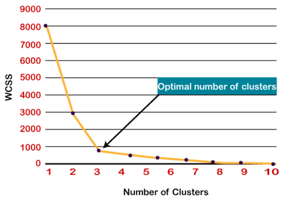
- Plots a curve between calculated WCSS values and the number of clusters K.
- The sharp point of bend or a point of the plot looks like an arm, then that point is considered as the best value of K.
Since the graph shows the sharp bend, which looks like an elbow, hence it is known as the elbow method. The graph for the elbow method looks like the below image:
Note: We can choose the number of clusters equal to the given data points. If we choose the number of clusters equal to the data points, then the value of WCSS becomes zero, and that will be the endpoint of the plot.
Python Implementation of K-means Clustering Algorithm
In the above section, we have discussed the K-means algorithm, now let’s see how it can be implemented using Python
Before implementation, let’s understand what type of problem we will solve here. So, we have a dataset of Mall_Customers, which is the data of customers who visit the mall and spend there.
In the given dataset, we have Customer_Id, Gender, Age, Annual Income ($), and Spending Score (which is the calculated value of how much a customer has spent in the mall, the more the value, the more he has spent). From this dataset, we need to calculate some patterns, as it is an unsupervised method, so we don’t know what to calculate exactly.
The steps to be followed for the implementation are given below:
- Data Pre-processing
- Finding the optimal number of clusters using the elbow method
- Training the K-means algorithm on the training dataset
- Visualizing the clusters
Step-1: Data pre-processing Step
The first step will be the data pre-processing, as we did in our earlier topics of Regression and Classification. But for the clustering problem, it will be different from other models. Let’s discuss it:
- Importing Libraries
As we did in previous topics, firstly, we will import the libraries for our model, which is part of data pre-processing. The code is given below:
# importing libraries
import numpy as nm
import matplotlib.pyplot as mtp
import pandas as pd
In the above code, the numpy
we have imported for the performing mathematics calculation, matplotlib is for plotting the graph, and pandas are for managing the dataset.
- Importing the Dataset:
Next, we will import the dataset that we need to use. So here, we are using the Mall_Customer_data.csv dataset. It can be imported using the below code:
# Importing the dataset
dataset = pd.read_csv(‘Mall_Customers_data.csv’)
By executing the above lines of code, we will get our dataset in the Spyder IDE. The dataset looks like the below image:

From the above dataset, we need to find some patterns in it.
- Extracting Independent Variables
Here we don’t need any dependent variable for data pre-processing step as it is a clustering problem, and we have no idea about what to determine. So we will just add a line of code for the matrix of features.
x = dataset.iloc[:, [3, 4]].values
As we can see, we are extracting only 3rd and 4th feature. It is because we need a 2d plot to visualize the model, and some features are not required, such as customer_id.
Step-2: Finding the optimal number of clusters using the elbow method
In the second step, we will try to find the optimal number of clusters for our clustering problem. So, as discussed above, here we are going to use the elbow method for this purpose.
As we know, the elbow method uses the WCSS concept to draw the plot by plotting WCSS values on the Y-axis and the number of clusters on the X-axis. So we are going to calculate the value for WCSS for different k values ranging from 1 to 10. Below is the code for it:
#finding optimal number of clusters using the elbow method
from sklearn.cluster import KMeans
wcss_list= [] #Initializing the list for the values of WCSS
#Using for loop for iterations from 1 to 10.
for i in range(1, 11):
kmeans = KMeans(n_clusters=i, init=’k-means++’, random_state= 42)
kmeans.fit(x)
wcss_list.append(kmeans.inertia_)
mtp.plot(range(1, 11), wcss_list)
mtp.title(‘The Elobw Method Graph’)
mtp.xlabel(‘Number of clusters(k)’)
mtp.ylabel(‘wcss_list’)
mtp.show()
As we can see in the above code, we have used the KMeans class of sklearn. cluster library to form the clusters.
Next, we have created the wcss_list variable to initialize an empty list, which is used to contain the value of wcss computed for different values of k ranging from 1 to 10.
After that, we have initialized the for loop for the iteration on a different value of k ranging from 1 to 10; since for loop in Python, exclude the outbound limit, so it is taken as 11 to include 10th value.
The rest part of the code is similar as we did in earlier topics, as we have fitted the model on a matrix of features and then plotted the graph between the number of clusters and WCSS.
Output: After executing the above code, we will get the below output:

From the above plot, we can see the elbow point is at 5. So the number of clusters here will be 5.

Step- 3: Training the K-means algorithm on the training dataset
As we have got the number of clusters, so we can now train the model on the dataset.
To train the model, we will use the same two lines of code as we have used in the above section, but here instead of using i, we will use 5, as we know there are 5 clusters that need to be formed. The code is given below:
#training the K-means model on a dataset
kmeans = KMeans(n_clusters=5, init=’k-means++’, random_state= 42)
y_predict= kmeans.fit_predict(x)
The first line is the same as above for creating the object of KMeans class.
In the second line of code, we have created the dependent variable y_predict to train the model. By executing the above lines of code, we will get the y_predict variable. We can check it under the variable explorer option in the Spyder IDE. We can now compare the values of y_predict with our original dataset. Consider the below image:

From the above image, we can now relate that the CustomerID 1 belongs to a cluster
3(as index starts from 0, hence 2 will be considered as 3), and 2 belongs to cluster 4, and so on.
Step-4: Visualizing the Clusters
The last step is to visualize the clusters. As we have 5 clusters for our model, so we will visualize each cluster one by one.
To visualize the clusters will use scatter plot using mtp.scatter() function of matplotlib.
#visulaizing the clusters mtp.scatter(x[y_predict == 0, 0], x[y_predict == 0, 1], s = 100, c = 'blue', label = 'Cluster 1') #for first cluster mtp.scatter(x[y_predict == 1, 0], x[y_predict == 1, 1], s = 100, c = 'green', label = 'Cluster 2') #for second cluster mtp.scatter(x[y_predict== 2, 0], x[y_predict == 2, 1], s = 100, c = 'red', label = 'Cluster 3') #for third cluster mtp.scatter(x[y_predict == 3, 0], x[y_predict == 3, 1], s = 100, c = 'cyan', label = 'Cluster 4') #for fourth cluster mtp.scatter(x[y_predict == 4, 0], x[y_predict == 4, 1], s = 100, c = 'magenta', label = 'Cluster 5') #for fifth cluster mtp.scatter(kmeans.cluster_centers_[:, 0], kmeans.cluster_centers_[:, 1], s = 300, c = 'yellow', label = 'Centroid') mtp.title('Clusters of customers') mtp.xlabel('Annual Income (k$)') mtp.ylabel('Spending Score (1-100)') mtp.legend() mtp.show() |
In above lines of code, we have written code for each clusters, ranging from 1 to 5. The first coordinate of the mtp.scatter, i.e., x[y_predict == 0, 0] containing the x value for the showing the matrix of features values, and the y_predict is ranging from 0 to 1.
Output:

The output image is clearly showing the five different clusters with different colors. The clusters are formed between two parameters of the dataset; Annual income of customer and Spending. We can change the colors and labels as per the requirement or choice. We can also observe some points from the above patterns, which are given below:
- Cluster1 shows the customers with average salary and average spending so we can categorize these customers as
- Cluster2 shows the customer has a high income but low spending, so we can categorize them as careful.
- Cluster3 shows the low income and also low spending so they can be categorized as sensible.
- Cluster4 shows the customers with low income with very high spending so they can be categorized as careless.
- Cluster5 shows the customers with high income and high spending so they can be categorized as target, and these customers can be the most profitable customers for the mall owner.